

Today I’m excited to share with you all the beautiful book Beyond Neutral by the talented John Q. Adams aka Quilt Dad. This is not John’s first book nor his last I expect…he is a man of many talents and one of the forces behind the Ezine Fat Quarterly. (And they have a couple of books too! Check those out! I really want their latest one on color!)
I like, like many women, find John’s take on the quilting world fascinating. Let’s be honest. Men are in the minority when it comes to the demographic of quilters. So his choices of patterns and fabrics are always interesting to me. There is some overlap, but I love to see a masculine perspective on quilting. And this book gives you that. John is not afraid of “natural neutrals” as he describes the colors of nature that balance out life.

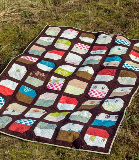
The main premise of John’s book is about using nature as an inspiration color palette for the backgrounds of his quilts. John rather aptly describes the “fear” that so many quilters have in using a background other than cream or white when piecing a quilt. And he boldly embraces the use of other colors that he sees commonly in nature, knowing that these colors will work in quilts because they work in nature. Our eyes are accustomed to seeing these “natural neutrals” all the time already. So why not use them in quilt backgrounds?

I love that when I look at John’s designs, I see quilts designed by a man. Because his quilts will be appealing to men. And we all know how hard it can be to find quilts that men will love…err…tolerate. 😉 His color palettes may well appeal more to men too. I would suggest showing John’s book the boys and men in your life that you are dying to make a quilt for. I bet they will find a pattern that they like!!
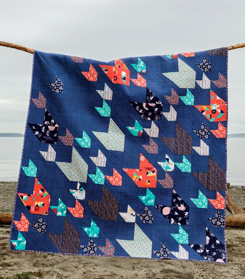
The quilt pictured above, Pacific Crest, the cover quilt, is easily my personal favorite from the book. I keep telling John that I’m going to make this. And I swear that in this lifetime I will. I just adore it. The dark blue background and the selection of colors is right on. But for me, it is the movement that this quilt has that makes it so special. I feel like these are shooting stars or arrows raining down on troops. It brings out my fanciful side and I like that.
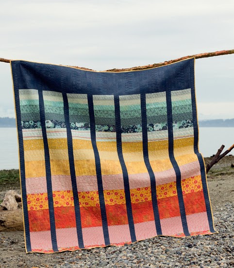
And the Cape Lookout quilt is a inspired by a sunrise or sunset. But I see a rainbow that will actually appeal to people who don’t care for “Rainbow quilts”. You know what I mean. The navy background is grounding this quilt in a way that white can not. It pulls you in rather than popping off the quilt. Both techniques are valuable to have in your pocket of color selection. And I’m inspired to continue using any color I want as the background for a quilt. I personally adore a robin’s egg blue for a background color and can make that work with any color scheme…just challenge me! lol<

The cover quilt looks fabulous! The color grey is my background of choice. However, I do find that I use whites quite a bit too.
For myself I love Navy! For gifting quilts I usually tend to use Greys. Thanks!
I love what I've seen of John's book so far! I've been using a lot of grey for background lately…but I'm loving the navy backgrounds I've been seeing, so I'm going to do it too!
Oh, dear. I'm a white girl by nature! *g* I just love shabby chic and white painted furniture and blousey roses in glass jars and they shout white backgrounded quilts! But I do try to use other colours – that navy is amazing!
Thanks for reviewing this book. I've just added it to my list. Moving beyond white and ash is very intriguing.
Navy blue is my favorite color for quilt top backgrounds. I'm working on my third quilt with navy right now!
Black Grunge by Moda for me 🙂 skeshlaman@comcast.net
Not crazy about using white and cream, I like brown's. Looks like a fun book. Nancy P.
Hola me gusta café claro!
Saludo tico y feliz fin de semana.
My favorite background is Black. it is so striking against brights.
this book looks very interesting and I"m glad a man wrote it.
I don't really have a favorite. I use a lot of color, but no particular one. I choose my background based on the pattern and color scheme I'm using.
I think gray (any shade). Black or navy would also be my choice as they ground a quilt nicely. I always try to use some black in a quilt whether it be in the binding or small accents. Thanks for the chance to win! shopgirl7232(at)yahoo(dot)com
I use white as my background most often, but I'm really trying to branch out. Maybe I'll do mint next time!
I usually use white or gray (love Essex yard-dyed in steel and Kona coal), but I'd love to branch out and do something with teal.
White or off white is what I tend to use. I really need to get out of my comfort zone.
Mine is black
Thanks for such a great review, Angela. I've been coveting this book for a while now and almost picked it up last time I was at a LQS. I love using Kona Ash or Medium Gray for my neutrals or scrappy low volume, but I've been wanting to try a Navy neutral lately too! I hope colors become the new trend in backgrounds, this book should definitely help!
Looks like a really great make-a-quilt-for-a-guy book. Your review of it is great, and thanks for sharing pictures too. White is my go-to background fabric. I have a whole bolt of Kaufman Kona White to keep me going. Thanks for the chance to win!
I use a lot of grays, all shades! I am also a fan of navy – I need a baby quilt and I'd like to try Half Moon Bay with a navy background next.
Definitely an intriguing book and a challenge to think outside of the box with backgrounds. I currently love various shades of grey and black. And I find the dark brown and navy to be simply stunning!!!
Navy for softer color schemes, white for blues, and black for brights.
love these projects and would love the chance to make some of them! my go-to background color is grey – in any shade.
Cream
Forgot my email.
lag110 at mchsi dot com
Hi, I like to use very light colors that make the colors in the quilt pop out a little. Thanks for a chance.
I like white!!!
Bright white is my favorite but I want to learn to be more bold! I've promised myself that my next quilt background will be something more unique, like gray or maybe mint green.
Thanks for the giveaway!
Cream/Tan is actually my favorite—that natural, not-quite-white color. PS This post was really funny to me! My husband "hates!" my quilts… unless they look like "something." I made one for my sister that literally has a drawing Nan Lawson did of her and my BIL on it, and he loves that because it looks like "something!" So funny!
grey is my favorite background colour
erin2470@hotmail.com
Depending on the quilt I usually use a beige color.
kdavis1@centurytel.net
I like to use Kona Snow!
Gray is my favorite background color, with navy coming in at a close second! Thanks for the giveaway!
I am liking grey as a background colour at the moment. I am intrigued by the brown used in this book too!
I've been using a lot of grey and white lately but have recently purchased some pastels colors to compliment the main blocks. It's nice to change it up.
I love Kona snow, but I plan on using other colors as well, depending on the quilt!
My favourite background colour is white, I have plans for quilts using other colours, but I haven't got round to them yet.
jen dot barnard at btinternet dot com
My favorite background is cream. Not very original, but I just like it.
I tend to use lots of white but I want to try and branch out.
I like it all..but red is my favorite neutral
I always tend to use white but I LOVE dark blue in a background! (and red!)
I seem to gravitate towards white or cream because it seems safe. I think I need to go out of my comfort zone as these quilts are stunning. kthurn@bektel.com
Kona Silver or Kona white for me. I want to make one with navy as the background soon though.
My favorite background color is warm white 🙂 homespunhandmaiden(at)yahoo(dot)com
I use a white on white background quite often as it shows so many colors well.
I use a lot of creams and whites but my favorite backgrounds are blues. love the book. Thanks.
I like the clean fresh look of a white background.
I like color and mottled basics best as background. I like to have some pattern present in the background. Basic Grey's Grunge prints suits me just fine. I would choose a dark taupe/khaki with flecks over beige or white for my backgrounds.
tushay3(at)yahoo(dot)com
Gray is my favorite right now but I recently saw a mulberry that I'm dying to try!
I tend to stick with black for some reason
I like gray, but I'm warming up to navy. I love how John encourages me to look around in nature for inspiration.