Today I’m excited to share with you all the beautiful book Beyond Neutral by the talented John Q. Adams aka Quilt Dad. This is not John’s first book nor his last I expect…he is a man of many talents and one of the forces behind the Ezine Fat Quarterly. (And they have a couple of books too! Check those out! I really want their latest one on color!)
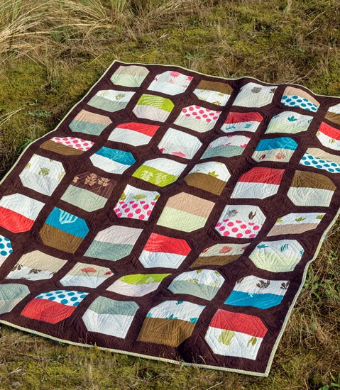

I like, like many women, find John’s take on the quilting world fascinating. Let’s be honest. Men are in the minority when it comes to the demographic of quilters. So his choices of patterns and fabrics are always interesting to me. There is some overlap, but I love to see a masculine perspective on quilting. And this book gives you that. John is not afraid of “natural neutrals” as he describes the colors of nature that balance out life.


The main premise of John’s book is about using nature as an inspiration color palette for the backgrounds of his quilts. John rather aptly describes the “fear” that so many quilters have in using a background other than cream or white when piecing a quilt. And he boldly embraces the use of other colors that he sees commonly in nature, knowing that these colors will work in quilts because they work in nature. Our eyes are accustomed to seeing these “natural neutrals” all the time already. So why not use them in quilt backgrounds?


I love that when I look at John’s designs, I see quilts designed by a man. Because his quilts will be appealing to men. And we all know how hard it can be to find quilts that men will love…err…tolerate. 😉 His color palettes may well appeal more to men too. I would suggest showing John’s book the boys and men in your life that you are dying to make a quilt for. I bet they will find a pattern that they like!!
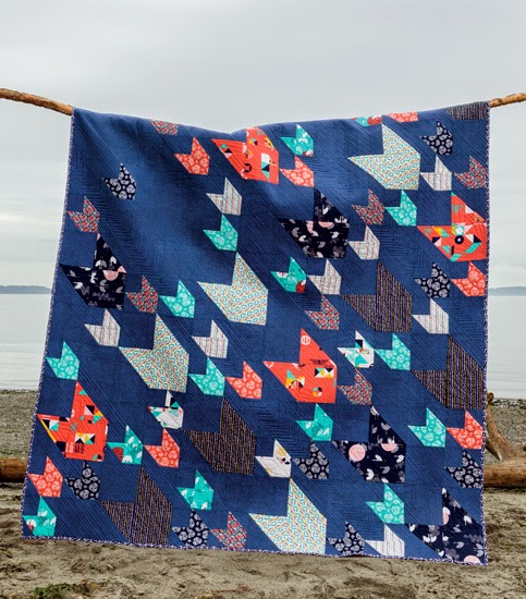

The quilt pictured above, Pacific Crest, the cover quilt, is easily my personal favorite from the book. I keep telling John that I’m going to make this. And I swear that in this lifetime I will. I just adore it. The dark blue background and the selection of colors is right on. But for me, it is the movement that this quilt has that makes it so special. I feel like these are shooting stars or arrows raining down on troops. It brings out my fanciful side and I like that.
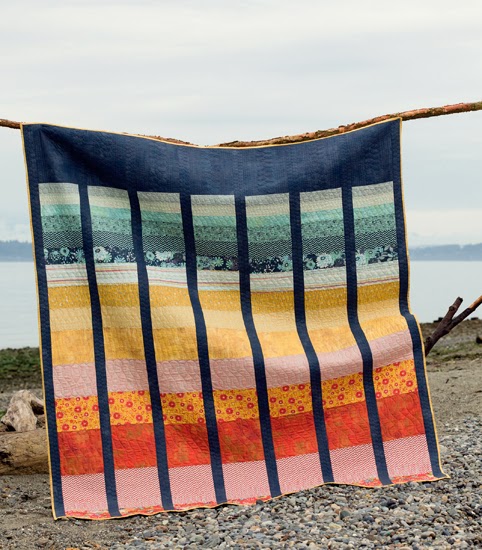

And the Cape Lookout quilt is a inspired by a sunrise or sunset. But I see a rainbow that will actually appeal to people who don’t care for “Rainbow quilts”. You know what I mean. The navy background is grounding this quilt in a way that white can not. It pulls you in rather than popping off the quilt. Both techniques are valuable to have in your pocket of color selection. And I’m inspired to continue using any color I want as the background for a quilt. I personally adore a robin’s egg blue for a background color and can make that work with any color scheme…just challenge me! lol<


Honestly, I'm new to this quilting gig and haven't used a background color yet since I love just going for bright colors in a basic block and an allover pattern.
I love to use gray! It makes all the other colors pop!
Well, I don't know if I have a favorite; I am intrigued by using prints as background. In the quilts I've made I've used black, white twice, pink ginham, light blue with white damask print, forest green, cream with yellow floral, green/pink/white, navy blue, and now I'm using white with grey dots. Interesting to think about! sarah@forrussia.org
I like white backgrounds. So crisp against bright colors.
I am trying to get away from white backgrounds! I've got quilts waiting to be made that have brown and green backgrounds instead of white 🙂
I still use mostly white or cream, but I'm working on a quilt now that has a darker gray as the background and I really like it.
I most often use Kona white & snow as background but have make a few quilts with Kona ash. I feel like I need to break out of my comfort zone & be a bit more adventurous in my fabric choices. Thanks for the chance to win this awesome book!
Lately I like grey.
My favorite is grey but I really want to make one with a navy background. I love the Pacific Crest quilt!
I have to confess — I do use white!
I like a smaller white on white print for backgrounds. I usually try to do no borders for a modern approach to quilts.
emily@reznechek.com
I really like the Nile Green color from the 30's.
I admit to Kona Snow, but I think I'll be doing a Navy background someday.
I love to use chocolate brown as a background on my fallish quilts and I recently made one with a deep orchid purple for my daughter…. but my favourite is a dark denim… it adds interest… honestly I haven't used much white and I often make quilts that don't have a sashing or border…
Definitely white and/or cream. I don't think I've ever used anything else. Maybe I should branch out!
Black with glow in the dark ships (Star wars print), for a Star wars mini quilt. Found this book at my Local Quilt Shop (Quilter's Paradise) while looking for some inspiration for the New Star wars prints that came into Joann's Clovis today.
I live in Maine so I'd like to try a background with a spruce green color!