

Today I’m excited to share with you all the beautiful book Beyond Neutral by the talented John Q. Adams aka Quilt Dad. This is not John’s first book nor his last I expect…he is a man of many talents and one of the forces behind the Ezine Fat Quarterly. (And they have a couple of books too! Check those out! I really want their latest one on color!)
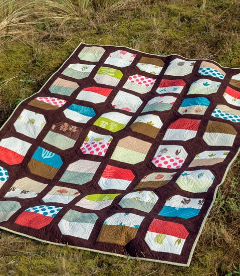
I like, like many women, find John’s take on the quilting world fascinating. Let’s be honest. Men are in the minority when it comes to the demographic of quilters. So his choices of patterns and fabrics are always interesting to me. There is some overlap, but I love to see a masculine perspective on quilting. And this book gives you that. John is not afraid of “natural neutrals” as he describes the colors of nature that balance out life.

The main premise of John’s book is about using nature as an inspiration color palette for the backgrounds of his quilts. John rather aptly describes the “fear” that so many quilters have in using a background other than cream or white when piecing a quilt. And he boldly embraces the use of other colors that he sees commonly in nature, knowing that these colors will work in quilts because they work in nature. Our eyes are accustomed to seeing these “natural neutrals” all the time already. So why not use them in quilt backgrounds?

I love that when I look at John’s designs, I see quilts designed by a man. Because his quilts will be appealing to men. And we all know how hard it can be to find quilts that men will love…err…tolerate. 😉 His color palettes may well appeal more to men too. I would suggest showing John’s book the boys and men in your life that you are dying to make a quilt for. I bet they will find a pattern that they like!!
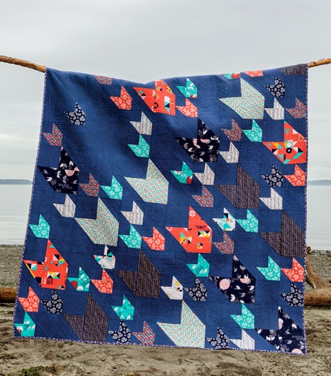
The quilt pictured above, Pacific Crest, the cover quilt, is easily my personal favorite from the book. I keep telling John that I’m going to make this. And I swear that in this lifetime I will. I just adore it. The dark blue background and the selection of colors is right on. But for me, it is the movement that this quilt has that makes it so special. I feel like these are shooting stars or arrows raining down on troops. It brings out my fanciful side and I like that.
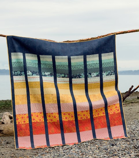
And the Cape Lookout quilt is a inspired by a sunrise or sunset. But I see a rainbow that will actually appeal to people who don’t care for “Rainbow quilts”. You know what I mean. The navy background is grounding this quilt in a way that white can not. It pulls you in rather than popping off the quilt. Both techniques are valuable to have in your pocket of color selection. And I’m inspired to continue using any color I want as the background for a quilt. I personally adore a robin’s egg blue for a background color and can make that work with any color scheme…just challenge me! lol<

My favorite background color of a quilt is grey.
I love grey and white however I have used black before and it was very striking!!
Cnmartinez04@gmail.com
I actually like khaki. It gives the look of a natural linen without the hassle and worry. thanks!!
I think my favorite is black but I have tried a few shades of gray and even white.
Each quilt is different, I let the other fabrics say what they want. 24Tangent@gmail.com
I'm still working out the negative space thing! But I've never used the some color twice. I love the dark blue of the cover quilt, even though blue is far from a go to color for me.
I have to admit I am partial to white, but am leaning towards grey or brown.
My favorite is light tan, but I enjoy seeing all these different colors as backgrounds. Thanks.
I like gray! the navy is so pretty though!! Thanks!!
I do more grey than anything but have also tried and liked navy, robin egg blue, yellow, and taupe.
I like grey a lot…. and probably use white the most!
I just can't get enough of grey 🙂 Thx.
I love white but I'd like to try navy after seeing Pacific Coast!
I like to use any shade of white as a background but am working on a quilt with a black background at the moment and am really loving it!
Call me traditional – I usually use white! But I keep trying to push myself to try other colors.
I have used cream but would really like to try one with baby soft pink for the background.
You mean there are people out there that don't care for rainbow quilts??! Gasp! I feel a sudden drive to make rainbow minis for all!
I was getting sick of gray for backgrounds, but then I used gray grunge and it has changed everything!
I'm a sucker for Kona Snow. : )
mostly white but i am tiring to get away from that thanks
It is white, but I don't mind others, depending on what is going on in the quilt.
HI, Yep it's WHITE !
Thanks for sharing a neat giveaway!
HAPPY STITCHING!
msstitcher1214@gmail.com
I'm too new to really know yet, but I'm thinking white at this point:)
I usually use gray, but I am going to experiment with blue, green, and yellow (in that order).
I am lazy and use white most of the time because it is easier.
I prefer gray (medium gray Kona) or white. I should try something different soon..
I love black as a background. It makes the design of the blocks kind of 'float' on the quilt top. Thanks for the opportunity. I think John's book looks VERY interesting. Hope I win!!!
At the moment I'm in love with using Kona coal grey as a background/neutral fabric for my quilts – especially the ones I've been making for my little boys. I love John's perspective of quilting and use of colors!
Definitely white, but I might get brave enough one day to try khaki or gray! 🙂
I tend to like grays or a mix of neutrals.
I like to pick a prominent color in the rest of the quilt. Most of ours have been burgundy
My favorite background color that I've ever used was turquoise. It was vibrant for a colorful friend. Next up is orange.
I generally use white as a background. But I am trying to branch out and I chose a dark gray for the background of a quilt that is nearly finished. Thanks for the giveaway!
Probably Kona Ash. It's my go to.
Probably grey or white, but seeing that navy quilt is really making me want to try that!
I use a lot of white and black, but my favorite was a quilt using the b&w Botanics print against solid rainbow hexies.
I tend to love back but lately I have tried Indigo blue and grey. pjrcontest@msn.com
my favourite is a rich blue.
White…but maybe I will branch out 🙂
My favorite background for a quilt is probably white but the quilt I am currently working on has a grey background that I am loving.
Kona Snow, but I'd like to try some other options such as a dark blue, red, or green.
Beautiful quilts! Another great book for the must-have list, hehe. I love quilts with white background. They always look so fresh!
Thank you for a super giveaway and a chance to win.
usairdoll(at)gmail(dot)com
John's quilts are great love the navy backgrounds must try this with my next quilt, I usually use colour backgrounds but mainly pinks for girls and blue for boys etc……j
Thank you for a chance to win this wonderful book I have had it on my wishlist.
I've only ever used white, but I'm now making a quilt with a white background and one which will have orange or yellow as the background
I am using hotpink as background which is a lovely change from white, cream and black
Light gray at the moment
My favorite to use is a black background.
I love these quilts and John's interesting use of color. My favorite colors to use as a background are white and grey, but I saw a beautiful quilt with a Ruby red background that I want to try!
I've mostly used white, grey and black for backgrounds but I bought this awesomely bright turquoise to use in an upcoming quilt that might be my favorite!
I've recently used grey, navy, & royal blue…..ready to try others!!
I love to quilt with bright colours and LOVE a good black background! I want to do a deep aqua soon! I'm in love with it and on the hunt for the right pattern!! (I think John might have nailed it!!)
my favorite background right now is a pale grey. Thanks for the giveaway! Mary
mburnette912@bellsouth.net