Hey all!
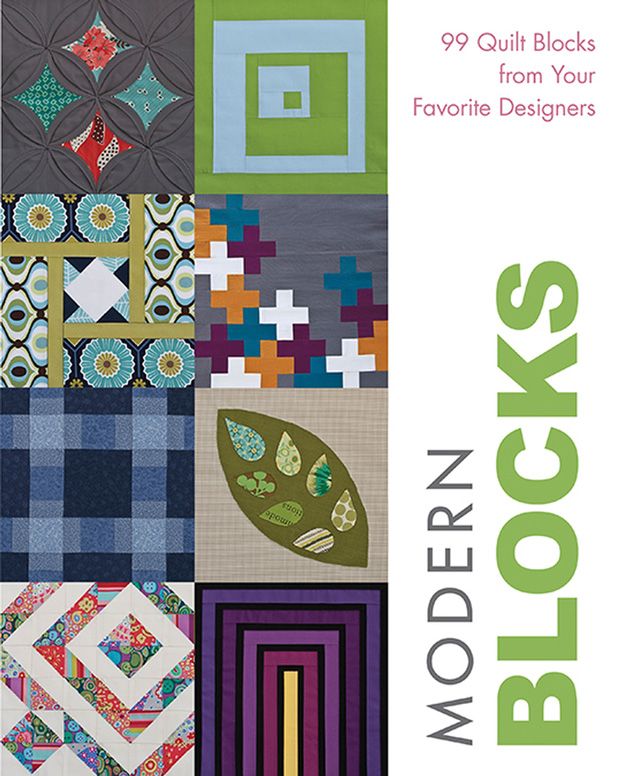
I’m finally grabbing a few moments to share the alternate colors for my blocks from the book Modern Blocks.

Some of these are more successful and some less so. But that’s the great part about me doing the trial and error for you. 😉 I can test out some ideas and see what works for a particular block.
Last Call:
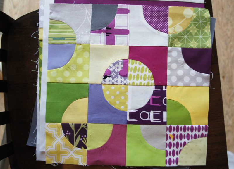

I made this with a mix of solids and patterns which I still think is a great way to go with this block. But in this block, as opposed to the one I put in the book, I made every single patterned piece a different fabric. And I gotta say…that was overkill. It ends up looking less cohesive because there is not enough overlap of fabrics. I think it would work with solids. (solid color schemes can be more forgiving). But with so many prints, and such a busy pattern to the block, the overall effect is just busy.
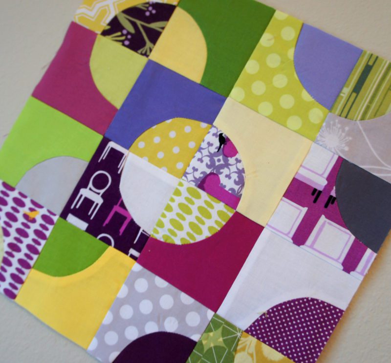

That’s not to say it’s not a lovely block and all. And it will still be going in my quilt eventually but I learned from this that I needed to scale back on the number of prints that I used in the block. Try it and see what you think!
Cross Walk:
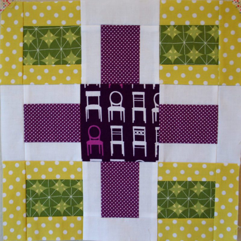

I actually really like how this one turned out. It’s obviously really different from the one in the book because I used less “interesting” prints. I love how clearly you can see the “Cross” of the pattern. And therefore the other blocks are nicely supporting of the cross. The tufted tweets may be kind of a strong color for the center, but you can’t deny that it pops. lol
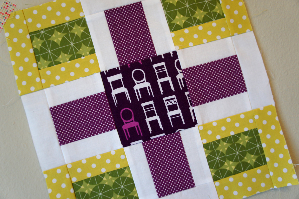

So you can see how this block will let you focus on ONE feature fabric and nicely frame it. I think it would be beautiful in all solids in a gradation of colors!
Slot Machine:
I accidentally deleted my pictures of this block other than one. lol My brain is over taxed. But I think that this block is successful and not at the same time.
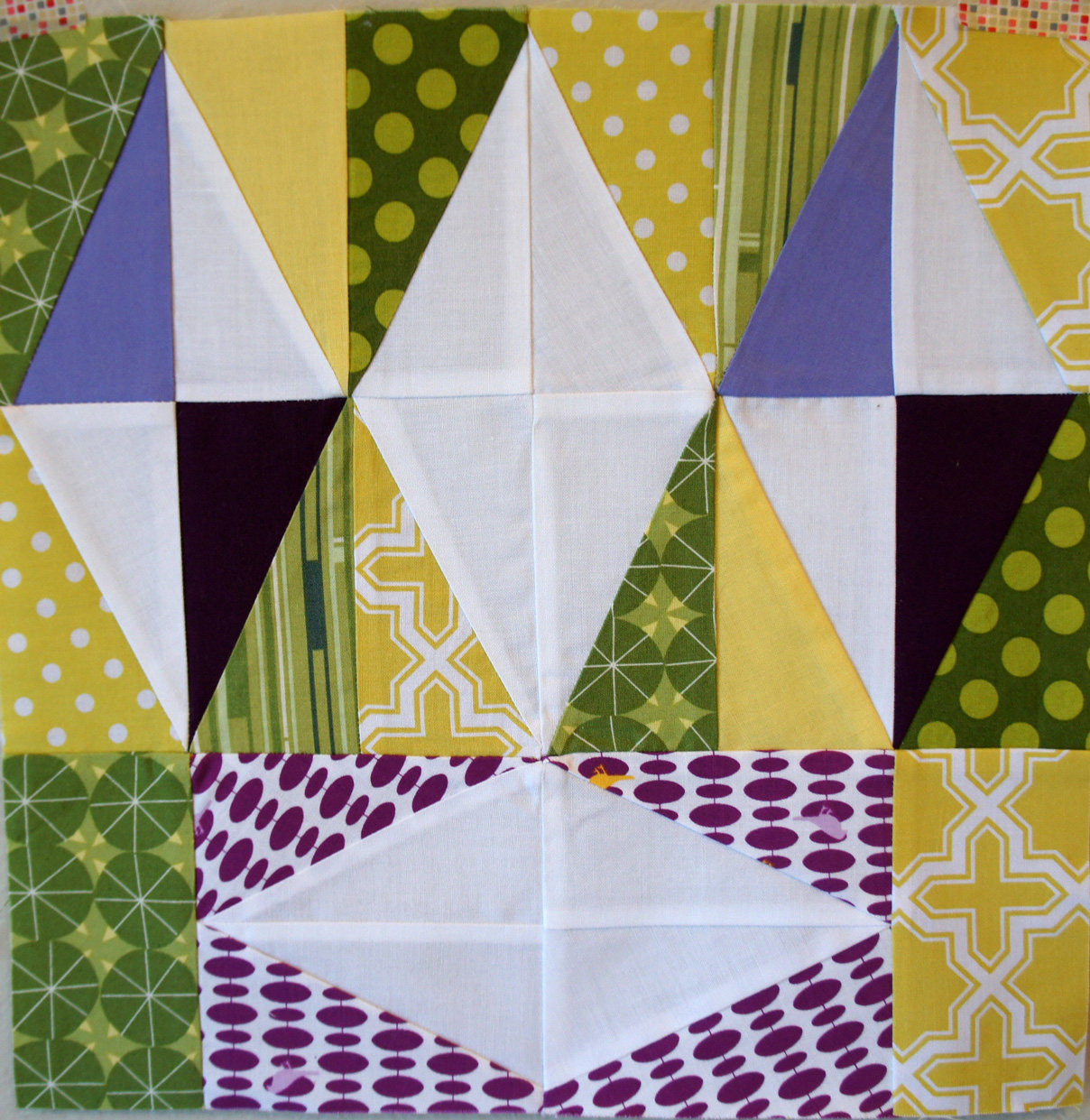

I really love how the top part of the block with the three diamonds turned out here. The mix of prints behind the diamonds is really effective here. They blend together and yet are interesting at the same time. The diamonds really still pop because they are done in solids while the background is the prints.
I’m going to admit though that I’m not as crazy about my choice for the bottom diamond. That tufted tweets pattern is just a little too busy for me as a background. I don’t think that it gels as well with the upper part of the block and thus they end up looking like too different blocks sort of thrown together. But I wanted to experiment with using different backgrounds for the different sections as the original block has all the same background.
What do you think?
So, was I honest enough with my own work today? lol I do really love my blocks! I’m just trying to give brutally honest feedback on my own versions of these blocks so you all can see options that may or may not be successful. And what I don’t prefer, you may love. Feel free to tell me that you love them. 😉
I do love these blocks, Angela! But I tend to agree with your own criticisms, except about the tufted tweets fabric on the bottom block – I think if the directionality of the dots had been more consistent, the fabric would have worked well! Nice work!!
Well, I loved the ones that were in the book. But I also have a tendency to see something I love and I have to make it exactly like that. Anyway, you did awesome on your blocks!
I saw the book yesterday in my LQS! How cool!
I asked the book for my birthday… and got it!
I love so many blocks!
My very favourite is 'all or nothing' and then 'slot machine'
Wonderful book; good for lots of inspiration.
I do agree with you on your own criticism regarding the colour choices. While all lovely, sometimes they don't gel as well as your final ones.
My book arrived today, now to find time to read it :oD
I think they all look great and I love the purples, yellows, and greens together!
Wow! I love all the purples, my fav!
Slot Machine is awesome! And your little one in the post below? Killing me. She's so cute!!
I like the fussy cut cross walk though agree that the prints do compete. The main colors I like, especially the purples, so same colors in less busy prints.